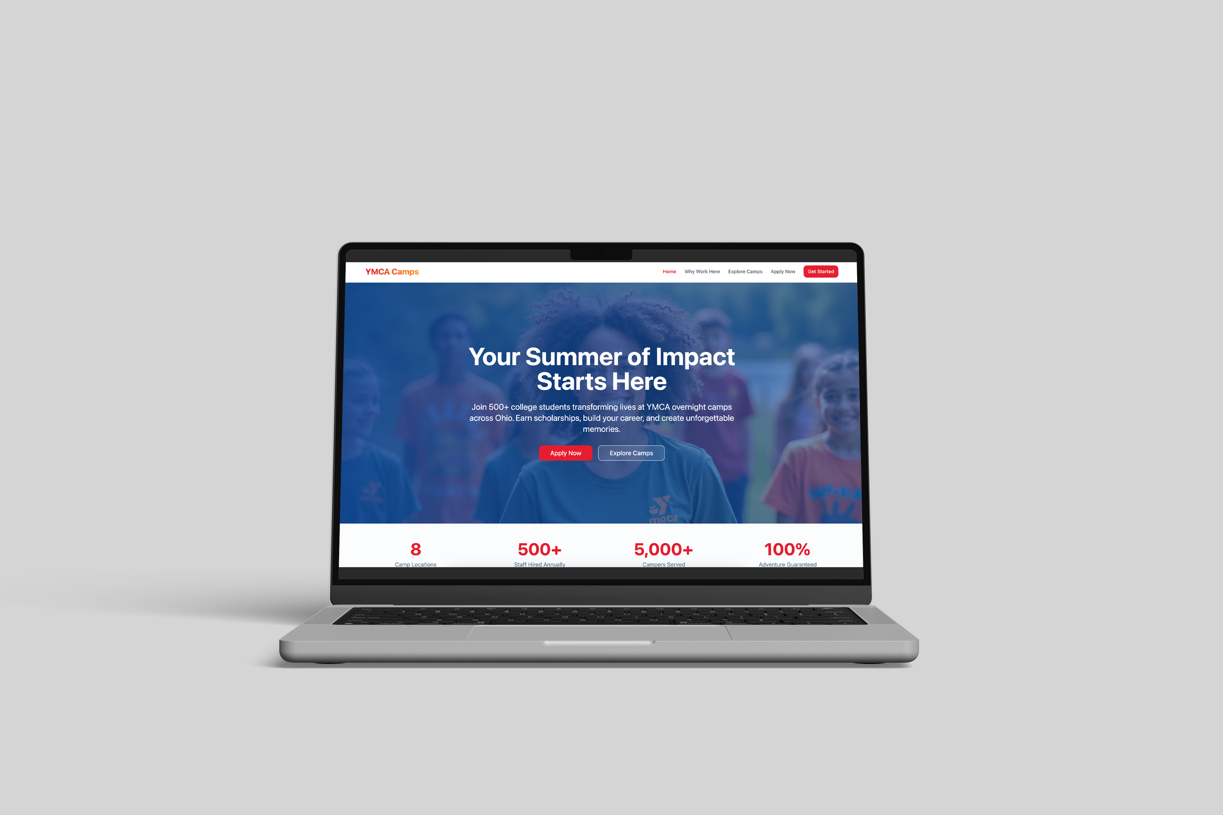
YMCA Ohio Camp Alliance Website
The YMCA Ohio Camp Alliance website addresses a common pain point: families and staff wanting a centralized place to view and compare all camps, rather than juggling multiple sites. It makes it easy to find every camp in one place and discover where they’re located geographically, simplifying search and decision-making. At the same time, it communicates mission, community, and opportunity; letting visitors quickly see the scope and impact of the camp network.
User Needs & Design Response
User Pain Points
Families had to navigate multiple YMCA websites, PDFs, and flyers to compare camps across Ohio. Information was inconsistent, hard to filter by location or camp type, and required too much effort during an already time-sensitive decision window.
No single place to explore all YMCA camps in Ohio
Difficult to compare offerings across regions
Confusing pathways from discovery to registration
High cognitive load for busy families making emotional decisions
2. Key Insights
Families weren’t looking for “more information”, they wanted clarity and confidence.
Through observation and feedback, it became clear that parents weren’t browsing casually. They were trying to answer fast, high-stakes questions:
Is this close to home? Is it safe? Is it right for my child?
What mattered most was:
Geographic clarity first
Simple filters over long descriptions
Trust signals tied to the YMCA brand
A calm, friendly experience that reduced stress
3. Design Strategy
Create one trusted, intuitive hub centered on how families actually choose camps
The design response focused on reducing friction and guiding families naturally from exploration to action.
Key decisions included:
A centralized statewide directory to eliminate fragmentation
Location-based browsing to match how families start their search
Clear visual hierarchy to support quick scanning
Consistent language and structure across all camp listings
A welcoming, human tone aligned with the YMCA’s values of belonging and care
The goal was not just usability, but reassurance.
4. Design Outcome
A calmer, more confident path from discovery to decision
The final experience transformed a scattered process into a clear, supportive journey. Families could easily explore, compare, and feel confident in their camp choice without feeling overwhelmed.
Reduced friction in camp discovery
Improved visibility for all Ohio YMCA camps
Stronger brand trust through consistency
A scalable foundation for future camp seasons and regional expansion